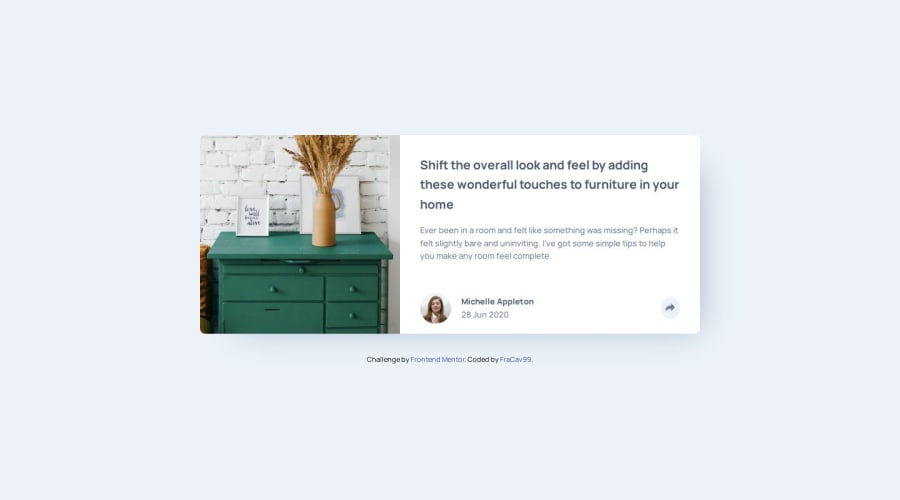


Design comparison

Solution retrospective
Yet another challenge completed! :) (after a long time!)
I'm really happy with the final result, especially because I've learnt some useful things along the way!
In particular this time, even though was a pretty simple challenge, I put particular emphasis about the accessibility topic, often underrated among front end devs.
In particular what I learnt how to trap focus and using ARIA attributes by reading Manuel Matuzovic's book and also experimenting in the use of screen readers.
NOTE: I'm not sponsoring this book! Is just a personal opinion.
At the end I also added some simple transitions to animate the popup opening, differently behaving based if it's on mobile or desktop.
Next time I would probably better plan on how to structure my HTML code, which affect how much and how I wrote CSS.
Bonus point is that writing semantic and accessible HTML is beneficial for writing CSS as well! :)
What challenges did you encounter, and how did you overcome them?As I started to experiment with accessibility and ARIA attributes, I had to learn new things about this topic, but Matuzovic's book is a great a guide for beginner and experienced developers, because has some useful explanations on how and why they works.
Also I started tweaking with transition and animations as well, so I had to dove deep into this.
What specific areas of your project would you like help with?I'd like to get some feeback about the aria attributes that I've used and in general what I've could have been done better on HTML, CSS and Javascript!
Please log in to post a comment
Log in with GitHubCommunity feedback
No feedback yet. Be the first to give feedback on Francesco's solution.
Join our Discord community
Join thousands of Frontend Mentor community members taking the challenges, sharing resources, helping each other, and chatting about all things front-end!
Join our Discord