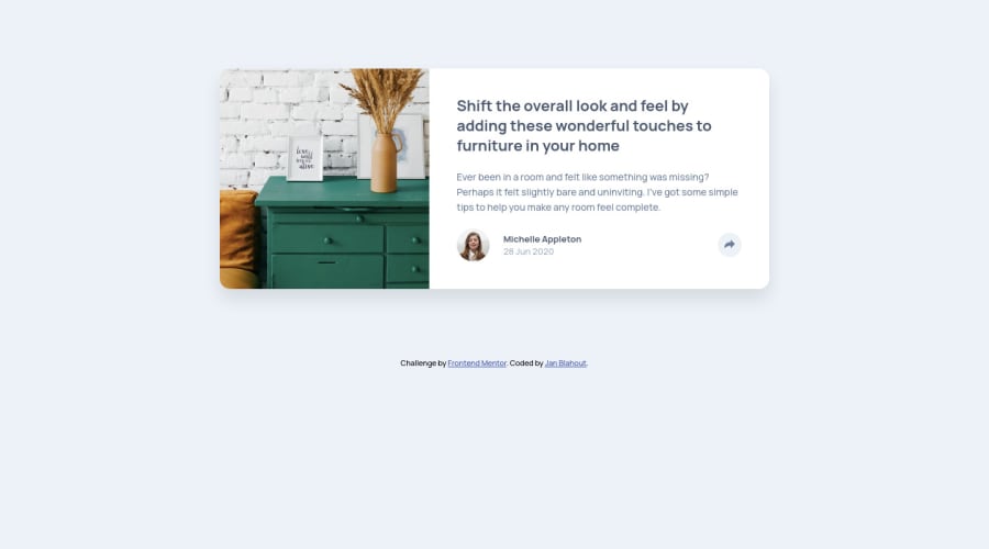
Design comparison
Solution retrospective
Hello,
another day, another challenge. And a hard one to be honest. Coming up with the popup was quite hard, I had to get inspired by the web. Also as I have found out playing with the image size its not easy at all !
I got completely lost when I had todo the mobile version of this. Positioning the popup window was tricky and I think I have done it completely wrong. Also the button (arrow) cant be seen when the window pops up. I tried Z-index but it didnt help. Any ideas how to fix it ?
Thanks and have a nice day,
Jan
Community feedback
- @markup-mitchellPosted over 3 years ago
Hi Jan,
Adding
position: relativeto the<svg>tag will allow it to participate in the stacking context established by.popupand cause it to appear above.popuptext.Please consider restructuring your markup so that
<button>is the root element to which the hide/show functionality is attached - the native button element is designed for this kind of thing and it's important for accessibility (among other things!).Marked as helpful0 - @JanBlahoutPosted over 3 years ago
Hi,
thank you so much for your feedback. That helped me so much !
Have a nice day,
Jan
0
Please log in to post a comment
Log in with GitHubJoin our Discord community
Join thousands of Frontend Mentor community members taking the challenges, sharing resources, helping each other, and chatting about all things front-end!
Join our Discord
