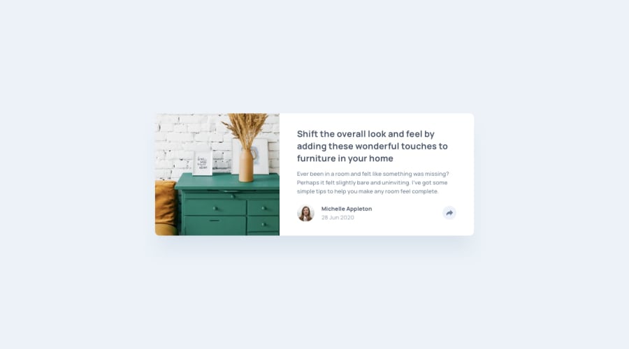
Article Preview Component (HTML, Vanila CSS and JQuery)
Design comparison
Solution retrospective
Let me know if there is any improvement to this submission.
Community feedback
- @ApplePieGiraffePosted about 4 years ago
Hey, Maxwell Ihiaso!
Nice work!
I think the text inside the component looks a little squished, for some reason. Consider looking into that to see what's going on!
Also, I think it would look nice if you added a little padding to the body of the page (or a little margin to sides the component, whichever you like), to give the component some space on either side when the viewport is resized.
Keep coding (and happy coding, too)!
2@Maxwell-ihiasoPosted about 4 years agoHi ApplePieGiraffe,
I guess I forgot to remove the cobwebs during my house-keeping. This was helpful. Let me revisit my code.
0 - @tarasisPosted about 4 years ago
👋 Maxwell
Your mobile solution looks great, well spaced and the share section is 👌.
The desktop def needs some more padding to fill up the space. The image is escaping its box so the top left and bottom left corners are not curved.
In
.content-footer-buttoncomment outflex: 1, that's what is causing the grey around share icon to go from (near) circular to oval on larger desktop sizes.CSS is clean, although personally not a fan of the nesting to indicate what belongs to what, but if it works for you then 👍
1@Maxwell-ihiasoPosted about 4 years agoThanks Tarasis,
This was super helpful. I will review my desktop version ASAP.
0
Please log in to post a comment
Log in with GitHubJoin our Discord community
Join thousands of Frontend Mentor community members taking the challenges, sharing resources, helping each other, and chatting about all things front-end!
Join our Discord
