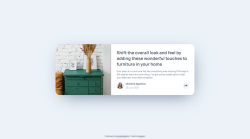
Submitted over 1 year agoA solution to the Article preview component challenge
Article preview component (HTML + CSS)
@Vanillatte68

Solution retrospective
What are you most proud of, and what would you do differently next time?
Getting the component look as close to the design and implementing share button
What challenges did you encounter, and how did you overcome them?Positioning share options so it won't obscure the share button when clicked
Code
Loading...
Please log in to post a comment
Log in with GitHubCommunity feedback
No feedback yet. Be the first to give feedback on Roselin Y's solution.
Join our Discord community
Join thousands of Frontend Mentor community members taking the challenges, sharing resources, helping each other, and chatting about all things front-end!
Join our Discord