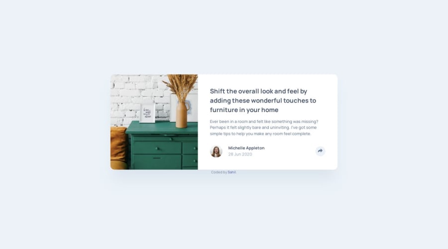
Design comparison
SolutionDesign
Solution retrospective
I'm wondering what the ideal balance is between animation and transitions in design❓ I don't want to overload the user with too many effects.
Community feedback
Please log in to post a comment
Log in with GitHubJoin our Discord community
Join thousands of Frontend Mentor community members taking the challenges, sharing resources, helping each other, and chatting about all things front-end!
Join our Discord
