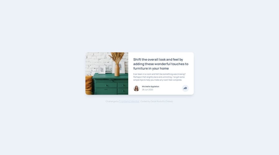
Article preview component [HTML & SASS]
Design comparison
Solution retrospective
I think something to be proud of is that it turned out acceptable XD, I think I have to name many things better, especially when going from mobile to desktop, surely there is a faster way to solve it.
What challenges did you encounter, and how did you overcome them?The challenge was how to interface with the active state, which turned out to be different from the desktop state, in the end I managed to solve it using position in CSS.
What specific areas of your project would you like help with?How to go to the next level, I would have to do it with React.js and Tailwind, I have seen, I try to do it with html and css to practice but I must also review React.js
Community feedback
Please log in to post a comment
Log in with GitHubJoin our Discord community
Join thousands of Frontend Mentor community members taking the challenges, sharing resources, helping each other, and chatting about all things front-end!
Join our Discord
