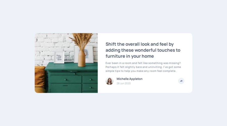
Design comparison
SolutionDesign
Community feedback
- @AnwarMestycerPosted 8 months ago
Hi Alejandro, You did well with the design; it looks good.
-
For mobile, try to place share-icon and
share_divin the same div and hide theshare_divinitially. Once the user clicks theshare_icon, hide theuser_divand display theshare_div, displaying them on top of each other is not a good practice. -
Add the else case once the user want to hide the share options, it's not included in your code just by adding an else statement that undoes what you changed in the if statement .
-
Add some semantic HTML to make your code accessible to screen readers.
I Hope this was helpful
Marked as helpful0 -
Please log in to post a comment
Log in with GitHubJoin our Discord community
Join thousands of Frontend Mentor community members taking the challenges, sharing resources, helping each other, and chatting about all things front-end!
Join our Discord
