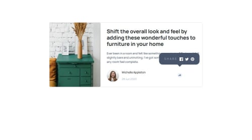
article-preview-component

Solution retrospective
The challenges that I encountered is the display of share icon with js in desktop and mobile version. It was too difficult , I've managed to do it, but everything's a mess. I'd like to do it better, understand it better and make beautiful creations.
What specific areas of your project would you like help with?I'd like someone to help me by explaining the part using js, look at my code and the display and you'll see the problem. The floating icons of the images show up without pressing the button and when you press it, it hides and on the mobile version, the floating icons take up all the space reserved for the other elements. Please help me
Please log in to post a comment
Log in with GitHubCommunity feedback
No feedback yet. Be the first to give feedback on Abdoulaye223's solution.
Join our Discord community
Join thousands of Frontend Mentor community members taking the challenges, sharing resources, helping each other, and chatting about all things front-end!
Join our Discord