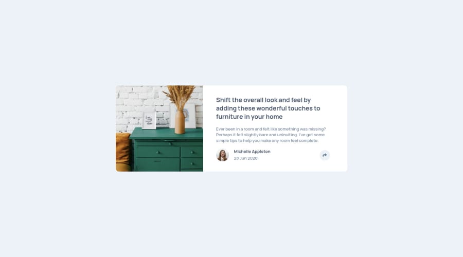
Design comparison
Solution retrospective
I don't know much javascript. I am a beginner. Your suggestions are very important to me. Thank you from now.
Community feedback
- @pikapikamartPosted about 3 years ago
Hey, good work on this one. Layout is really good both desktop and mobile view. Responds well and no other issues in terms of layout. Well done.
Some suggestions would be that:
- I see that you used
position: absolute
on yourmain
tag. I strongly suggest that you avoid usingposition: absolute
on a large content, like this one (treating as a whole layout content). To center your main tag, on yourbody
tag, you can add these codes:
align-items: center; display: flex; justify-content: center; min-height: 100vh;
Adding a
min-height: 100vh
is a good practice especially when your website only contains a small portions but wants to be capture inside the whole screen. But do not mistakemin-height: 100vh
onheight: 100vh
okay. The latter is bad :>Also if you apply what I suggested, you can now remove these properties on your
main
tag:left: 50%; top: 50%; transform: translate(-50%, -50%);
- By doing the above mentioned, you will see that your toggle for the social media links is out of place. You can make those be relative to the
.text-div
element. Since that element is acting the parent, having thatposition: relative
would be really good, and you can just adjust the placement of the social media, as well as the social media toggler. - Also, a better element for your toggler, instead of just using
i
tag, wrap thati
tag inside abutton
element. This adds more accessibility on your solution. - Your
script
tag should be above before the end tag of thebody
. It would be like:
</body>
- Also, I checked your js, it seems that you managed all of the stylings in there. A good rule of thumb, if it can be done in css, specially stylings, do it there. A better approach is that, for example. If I click on that
button
or toggler, myeventListener
would add a extra class in my markup. For example, it would add atoggled
class name on my.text-div
element. Then in my css, I could just managed all the state that are declared in the javascript. Using also scss would be more powerful.
But still, you really did a good job in here. Also, if you have questions, just drop it here okay.
Marked as helpful2@bbnos202Posted about 3 years ago@pikamart Thank you very much for your comprehensive comment and interest. I will try to implement what you said for my next projects. I hope I can do as you say. :)
0 - I see that you used
Please log in to post a comment
Log in with GitHubJoin our Discord community
Join thousands of Frontend Mentor community members taking the challenges, sharing resources, helping each other, and chatting about all things front-end!
Join our Discord