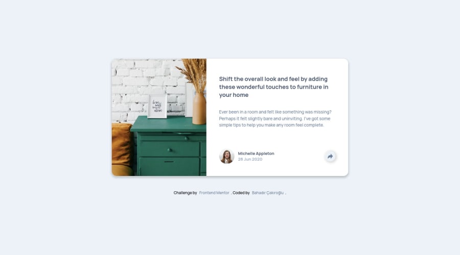
Design comparison
SolutionDesign
Solution retrospective
Any kind of suggestion appreciated :).
Community feedback
- @ChamuMutezvaPosted over 3 years ago
Greetings. So far so good. Here are a few things to look at
- heading elements (h1, h2 etc) has to be applied in order without skipping headings as well. Check the article on MDN for reasons which include how screen readers interpret it to assistive technology users
- the arrow icon is not centered in the parent container.
- the social icons, I would prefer them in an ordered list. Happy coding
Marked as helpful1@askugiiPosted over 3 years agoHi @ChamuMutezva, thank you so much for feedback.
-
Changed some of the h2 tags to h1 tags.Hope it helps.
-
Setted (margin: auto;) to center the arrow.Hope it is good.
-
I generally do not use list property so this was a change for me.And i think i'll use them more often.
I hope this is good enough, at least better.
0 - @ChamuMutezvaPosted over 3 years ago
Greetings. So far so good. Here are a few things to look at
- heading elements (h1, h2 etc) has to be applied in order without skipping headings as well. Check the article on MDN for reasons which include how screen readers interpret it to assistive technology users
- the arrow icon is not centered in the parent container.
- the social icons, I would prefer them in an ordered list. Happy coding
0
Please log in to post a comment
Log in with GitHubJoin our Discord community
Join thousands of Frontend Mentor community members taking the challenges, sharing resources, helping each other, and chatting about all things front-end!
Join our Discord
