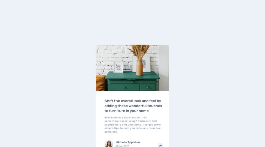
Design comparison
Solution retrospective
I have a few questions about this project, and i'll be very glad to everybody who would reply me ! )
About the styling, so css (i guess), first of all, how i can get the white arrow in the button after pressing it? i tried many possibilities, but being an img i really don't know how to change the color..;
Second question, also about the button, i add the hover, but i wanted to leave the darkest color of the arrow background after clicking on it, i tried the visited element but it ddidn't work for some reason.. i don't know why..;
Third question, in my way you must click to let appear the "cloud", and click again to let it disappear, i wanted to improve such situation that when you just hover on the button the cloud appear, and disappear when you move out the cursor, without clicking on it, i think is js but i didn't found the correct sintax, or maybe i should add something in the html tag instead of onclick, i don't know )
Last question, but is just a curiosity, i wonder if i could add this action with eventListener, instead of an onclick =function in the html tag )
I hope is not to long to read, anyway i really thanks all who will explain me even one of this point, thank you guys and everybody happy coding!! ))
Community feedback
Please log in to post a comment
Log in with GitHubJoin our Discord community
Join thousands of Frontend Mentor community members taking the challenges, sharing resources, helping each other, and chatting about all things front-end!
Join our Discord
