

Design comparison
SolutionDesign

Solution retrospective
How can I improve my code?
Please log in to post a comment
Log in with GitHubCommunity feedback
- @0xabdulkhaliq
Hello there 👋. Congratulations on successfully completing the challenge! 🎉
- I have other recommendations regarding your code that I believe will be of great interest to you.
CSS 🎨:
- Looks like the component has not been centered properly. So let me explain, How you can easily center the component without using
marginorpadding.
- We don't need to use
marginandpaddingto center the component both horizontally & vertically. Because usingmarginorpaddingwill not dynamical centers our component at all states
- You already using
Flexboxfor layout, but you didn't utilized it's full potential. Just add the following rules to properly center the component.
body { min-height: 100vh; }- Now remove these styles, after removing you can able to see the changes
@media (min-width: 47rem)
body {
margin-top: 8rem;
}

.preview-card {
margin: 5rem 1.5rem 5rem 1.5rem;
}
- Now your component has been properly centered
.
I hope you find this helpful 😄 Above all, the solution you submitted is great !
Happy coding!
- @NehalSahu8055
Hello Coder 👋.
Congratulations on successfully completing the challenge! 🎉
Few suggestions regarding design.
- Add
min-height:100vhin the body to properly center your card - To proper align the image as per fem design. Add:
.article__img { object-fit: cover; object-position: left; }- Use some
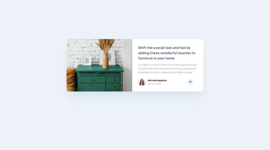
meaningful and descriptive altfor non decorative image likeDrawer with some decorative items above it.
I hope you find this helpful.
Happy coding😄
- Add


Join our Discord community
Join thousands of Frontend Mentor community members taking the challenges, sharing resources, helping each other, and chatting about all things front-end!
Join our Discord