

Design comparison

Solution retrospective
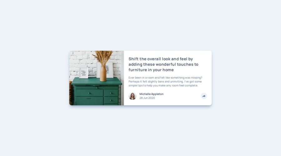
I'm most proud of the share view popup when clicking the share button, I'd want to use animations for pop-ups and slide-ups next time.
What challenges did you encounter, and how did you overcome them?Had some trouble styling the text at first to fit the correct height, I didn't know how to check the image dimensions provided in Figma. Had a LOT of trouble trying to make the share popup reusable for both use cases mobile and desktop, don't know how to make them reusable as in the mobile version, its placement is based on the entire text content div, but in the desktop version, its placement is based on the share button's position. So I put two copies of the same component, one in the share button and one in the text content and toggle if correct screen size.
What specific areas of your project would you like help with?Probably about the share popup view, I'm interested what's the conventional way of implementing it. Also how would you position the image? I used a lot of fixed pixel positioning to get it to display, and didn't really flow accordingly to flexbox or something.

Join our Discord community
Join thousands of Frontend Mentor community members taking the challenges, sharing resources, helping each other, and chatting about all things front-end!
Join our Discord