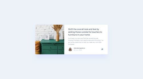
Article Preview Component (CSS/JS)

Solution retrospective
I learned new attributes and experimental css rules such as the popover API and anchor-name. At the end I didn't use these but I did some experiment and I think it will be great for placements of popover when the browser support will be better.
I pushed the requirement a bit further by adding more interaction in javascript for :
- click => open share links
- click => close share links
- click outside of the button => close share links
- press escape key => close share links
I keep learning about accessibility testing.
- I learned about tools such as axe and wave.
- testing reflow, keyboard navigation and voice over
I wanted to use the popover attribute but faced some issue to style it respecting the design. After a while trying to find a way to use this attribute on mobile and desktop I decided to switch back to a classic div and JavaScript functions. I felt I needed to add a lot of markup to respect the figma design between mobile and desktop. The fact that the element is displayed in the top layer made it complicated to style it on mobile because the popover element isn't influenced by parent display or overflow properties.
What specific areas of your project would you like help with?Accessibility. I tried to do my best with svgs, links and keyboard navigation. I'm always open to suggestion for improvement in this area.
Please log in to post a comment
Log in with GitHubCommunity feedback
No feedback yet. Be the first to give feedback on Gwenaël Magnenat's solution.
Join our Discord community
Join thousands of Frontend Mentor community members taking the challenges, sharing resources, helping each other, and chatting about all things front-end!
Join our Discord