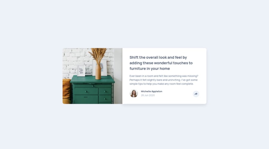
Design comparison
SolutionDesign
Solution retrospective
Feedbacks are Highly recommended
Community feedback
- @vanzasetiaPosted almost 3 years ago
👋 Hi Al71one007!
🎉 Congratulations on finishing this challenge! I would recommend putting each project or solution in its own repository. It's much easier for people to see your code.
Feedback:
- Accessibility
- Don't use
sectionfor the card content since it is not a full webpage. This is one chunk of content that all belong together and in a real website would sit with other content. - For any decorative images, each
imgtag should have emptyalt=""andaria-hidden="true"attributes to make all web assistive technologies such as screen reader ignore those images. In this case, the drawer image is decorative only. - For the avatar, you can use the author's name as the alternative text.
- Use CSS to uppercase the text. The uppercased word in the HTML will be spelled by the screen reader (spelled letter by letter).
- The share button should be wrapped with
buttonelement. - The alternative text for the share icon should be share (no button). The alternative text of the share icon works as the text content (label) of the link.
- Use
remor sometimesemunit instead ofpx. Usingpxwill not allow the users to control the size of the page based on their needs.
- Don't use
- Visual
- On mobile there's a bug where after the user wants to hide the social media icons, the dark gray background still appears.
- JavaScript
- Separate the event listener with the
function. - Don't inline styling in JavaScript. Use CSS classes instead.
- Separate the event listener with the
- Sass
- Don't nest too much. It can produce a high specificity stylesheet. The only time that it is recommended to nest is when using
@mediaquery and pseudo-element. - Always use classes to reference all the elements that you want to style. Using
idis going to make your stylesheet have high specificity (hard to maintain). - Compile all the Sass code into one CSS file. Having two stylesheets can impact the site loading speed.
- I would recommend converting all the
pxvalue intoremby creating arem()function.
- Don't nest too much. It can produce a high specificity stylesheet. The only time that it is recommended to nest is when using
/* In Sass */
body {
  font-size: rem(16);
}

/* In CSS */
body {
  font-size: 1rem;
}
That's it! Hopefully, this is helpful!
0@Alone-07Posted almost 3 years ago@vanzasetia Thanks for your feedbacks, I will change all you mentioned above. Now, I am requesting you to check my JavaScript file and tell me, that is it ok or not?
Again Thank you!!!
0 - Accessibility
Please log in to post a comment
Log in with GitHubJoin our Discord community
Join thousands of Frontend Mentor community members taking the challenges, sharing resources, helping each other, and chatting about all things front-end!
Join our Discord
