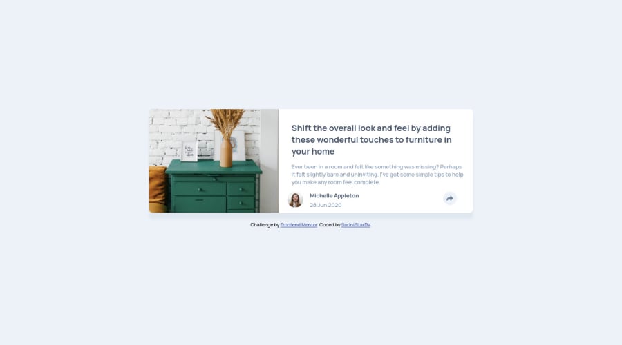
Article preview component challenge hub by Sprint
Design comparison
Solution retrospective
Hi everyone!
I have no questions in partciular regarding this challenge besides the one I left in the CSS file that can be found in the repositery (I left it there for context), & remain open to any remark that can help me improve my code in general!
Community feedback
- @vanzasetiaPosted almost 3 years ago
š Hi Sprint!
š Congratulations on finishing this challenge! I have some feedback on this solution:
- Accessibility
- All the page content, except your attribution should be wrapped with
main
tag. There's no needheader
in this case. - Your attribution should be inside the
footer
.
- All the page content, except your attribution should be wrapped with
<body> <main> the card element goes here... </main> <footer class="attribution"> your attribution goes here... </footer> </body>
- The share button should use a
button
element (notdiv
). - Always wrap text content with meaningful tag (
p
). - Only use
div
andspan
for styling purposes. - Create a custom
:focus-visible
styling to any interactive elements (button
, links,input
,textarea
). This will make the users can navigate this website using keyboard (Tab
) easily. - For any decorative images, each
img
tag should have emptyalt=""
andaria-hidden="true"
attributes to make all web assistive technologies such as screen reader ignore those images. In this case, all images are decorative only, except the avatar. - For the avatar, you can remove the avatar word. There's no need to say that it is an image, picture, or photo as long as you are using the
img
tag, the screen reader will pronounce it as an image. - Each social media icon should be wrapped with an anchor tag.
- Learn how to make
svg
accessible. If the icon is decorative or informative (meaningful), then you should know what to do. - For the
SHARE
text, you should not uppercase it on the HTML. The screen reader will spell it letter by letter instead of pronouncing it as a word. - Also, wrap the
SHARE
as a word, not letter by letter.
<div class="shaR"> <span class="sp1">S</span> <span class="sp1">H</span> <span class="sp1">A</span> <span class="sp1">R</span> <span class="">E</span> </div>
- About the class name, make it readable and meaningful. The other developer (it might be you in the future) might get confused.
- Use
rem
or sometimesem
unit instead ofpx
. Usingpx
will not allow the users to control the size of the page based on their needs. - Styling
- There's no need to set
min-width: 100vh;
to thebody
element, since by default it's already full width. - After you change the HTML markup, you can make the
body
element as a flexbox container to make the card perfectly in the middle of the page.
- There's no need to set
body { display: flex; align-items: center; justify-content: center; min-height: 100vh; }
- Instead of giving
width
with%
unit to each element inside the card, I would recommend addingpadding
to the card instead to prevent the text inside it from having full width inside the card. - Visual
- The card on my mobile view (375px * 640px) and desktop view (1280px * 800px) gets cut off (the right side).
- The tooltip doesn't show up in the correct place on desktop view.
- Best Practice (Recommended)
- Write your styling for mobile layout first (mobile-first approach). It often makes me write less code.
- Setting the
width
andheight
on thebody
element makes the page not responsive. So, if I need to set a height on thebody
element, I usually set amin-height
.
I would recommend doing the HTML and CSS challenges first, and after that, you can do the JavaScript challenges. It's important to have a solid knowledge of HTML (semantic markup, landmark, etc) and CSS (flexbox, grid,
rem
&em
units, etc).That's it! Hopefully, this is helpful!
Marked as helpful0 - Accessibility
Please log in to post a comment
Log in with GitHubJoin our Discord community
Join thousands of Frontend Mentor community members taking the challenges, sharing resources, helping each other, and chatting about all things front-end!
Join our Discord