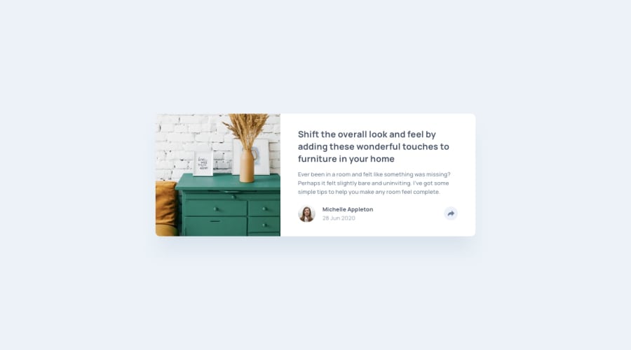
Design comparison
Solution retrospective
Any advice on how to make the pop-up for desktop look better?
I'm not the best at positioning elements outside of using Flexbox or Bootstrap, so this was probably my hardest challenge, and I know it's something I can improve on.
Community feedback
- @azhar1038Posted over 2 years ago
Hi Jane, wonderful work there!
Positioning the popup in desktop was probably the most difficult part of this challenge (at least for me 😅). For x-axis I used
%value instead of fixed amount along withtranslateXandcalcto position the popup.First you will have to position that section w.r.t that bottom footer where the share button is present, then do:
.popup {
    left: 100%;
    transform: translateX(-50%);
}
This will move the center of popup to the right boundary. Then do some calc to negate the padding and half of the share button size to move it left to the center. Check out my solution: Article preview component
Another accessibility tip, the extra close button that you have added, try to make it a button instead of div and give it an
aria-labelif you are using some fancy characters which screen readers may not understand.One small issue I noticed with mobile view is the size of card changes when share menu opens because author part and share menu have different height.
Hope it helps :)
Marked as helpful1
Please log in to post a comment
Log in with GitHubJoin our Discord community
Join thousands of Frontend Mentor community members taking the challenges, sharing resources, helping each other, and chatting about all things front-end!
Join our Discord
