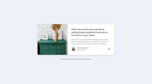
Article Preview Component

Solution retrospective
I'm proud that I've begun the JavaScript path, and was able to achieve the basic functionality required, although, I do believe it needs some work. I learned a ton in this challenge, by getting stuck so many times, stopping to read up from many resources, asking questions, trying, failing, and trying again.
What challenges did you encounter, and how did you overcome them?So many. A significant challenge was getting the positioning of the dialog in the correct spot, and then the arrow that points to the button on the desktop version in the active state. Since I decided to use just 1 button to toggle the hidden component instead of adding another button to close it, I had to refractor my html. Originally I had the avatar, author name and publication date inside a footer tag, within the card but not contained with the rest of the content. When I refractored this to be a regular div, and moved it within the same container as the other card text, I realized the dimensions of the hidden content will need to take into account the padding of the card body. With absolute positioning on the "share options" content, I used negative right, bottom, and left rem's. The desktop version was even more difficult, and I actually hope to receive advise on a better approach. My solution involves setting explicit widths and weird percentages for positioning.
What specific areas of your project would you like help with?Besides what I mentioned above, accessibility standards. I don't think my focus is correct for the social media links. I'm not sure if focus should be trapped within this div when it is active. Of course, I am always open to all feedback and suggestions for improvement.
Please log in to post a comment
Log in with GitHubCommunity feedback
No feedback yet. Be the first to give feedback on jasoneczek's solution.
Join our Discord community
Join thousands of Frontend Mentor community members taking the challenges, sharing resources, helping each other, and chatting about all things front-end!
Join our Discord