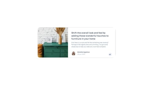
Submitted over 1 year agoA solution to the Article preview component challenge
Article preview component
@MitaliShah

Solution retrospective
What are you most proud of, and what would you do differently next time?
- CSS for tooltip.
- CSS took a long time for active state. I used z-index to show tool tip on top of other children.
- Any feedback on how I can improve this would be helpful!
Code
Loading...
Please log in to post a comment
Log in with GitHubCommunity feedback
No feedback yet. Be the first to give feedback on Mitali Shah's solution.
Join our Discord community
Join thousands of Frontend Mentor community members taking the challenges, sharing resources, helping each other, and chatting about all things front-end!
Join our Discord