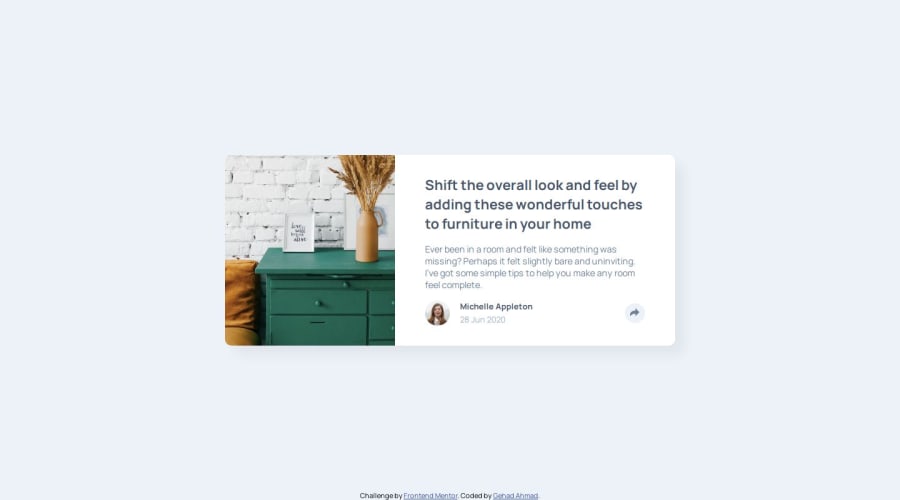
Design comparison
Solution retrospective
Using animations for the appearing and disappearing of the icons.
What challenges did you encounter, and how did you overcome them?I had a problem positioning the div of the icons in the mobile view.
I used the dev tool to know the suitable numbers for the top and left margins, but I think there should be a more convenient way to do it.
What specific areas of your project would you like help with?The positioning of the icons' dev and any feedback is welcomed :)
Please log in to post a comment
Log in with GitHubCommunity feedback
- @jolman009
Your HTML, CSS, and JS layouts look very clean and well-structured. One suggestion Id make is to check the layout using the Responsibly app. The small screen output is a little off-centered. Other than that, great job with integrating javascript!
Marked as helpful
Join our Discord community
Join thousands of Frontend Mentor community members taking the challenges, sharing resources, helping each other, and chatting about all things front-end!
Join our Discord
