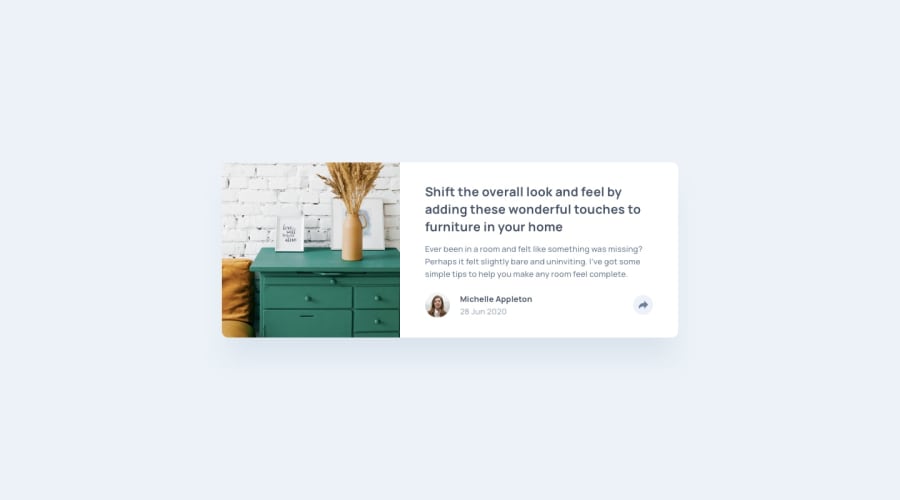
Design comparison
Solution retrospective
This one challenged me; I tried my best to make it look close to the template. I would like to thank Ali Haghighi and give credit to this good friend who helped me and taught me some new techniques for this challenge :)
His Linkedin:
https://ir.linkedin.com/in/haghighiali?trk=people-guest_people_search-card
Also, he has done this project out of self-interest and passion; if you like to check it out: https://www.ciarel.com/#/
Any suggestions would be appreciated!
Community feedback
- @elaineleungPosted over 2 years ago
Hey Ash, first off, great job with this component; both the desktop and mobile views look the way they should as in the design, and the responsiveness is also pretty good as the views are kept optimal.
About the share button, I think it's pretty hard when the button isn't part of the same container as the share icons. What you can try is, on the
.user-sharecontainer, usealign-items: flex-endinstead ofcenter, and see whether that slight shift might help.I took a different approach in my solution, but you can see whether that gives you some ideas on how else to approach this problem: https://www.frontendmentor.io/solutions/responsive-article-preview-component-hb8e6pLuv
Marked as helpful1@ashkanmusPosted over 2 years agoHello again @elaineleung! I hope you are having a great weekend! Thanks very much for your kind compliment; it motivates me a lot; I must admit it was very challenging, and a friend helped me and taught me some techniques.
Regarding the share button alignment, I just tried to improve it by giving a bottom padding to the share icons; it looks better to me now; however, I would certainly try your way as well!
Thank you so much again!
1
Please log in to post a comment
Log in with GitHubJoin our Discord community
Join thousands of Frontend Mentor community members taking the challenges, sharing resources, helping each other, and chatting about all things front-end!
Join our Discord
