Design comparison
Community feedback
- P@JomagenePosted 8 months ago
Fantastic Work!
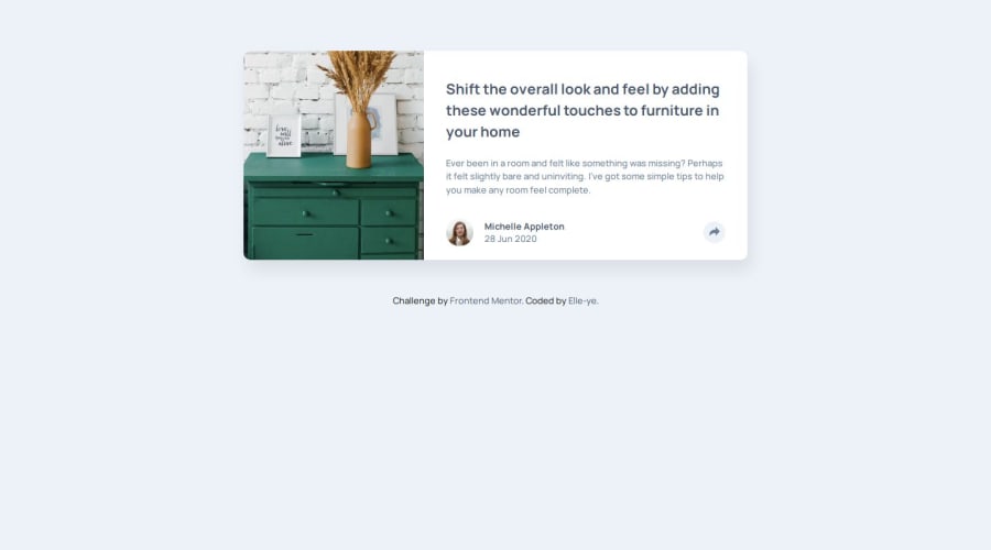
Your article preview component is visually appealing, and I really appreciate the smooth animations you've implemented. The tooltip transitions seamlessly on both desktop and mobile views, is awesome. It's clear you've put a lot of effort into this project, and it shows!
HTML Structure:
-
Minor Tagging Issue: I noticed a small error in your code where the closing tags for
<main>and<article>are in the wrong order near the end of your document. Since<main>is the parent of<article>, the<article>tag should be closed before the<main>tag. It's a simple fix that will enhance the semantic structure of your code. -
Improving Semantics: You’ve done an excellent job using the
<figure>tag for wrapping images. To further enhance the semantics and accessibility of your code, you might consider using<figure>for the profile section as well. This is more meaningful than a<div>and would better convey the content's purpose.- Suggested improvement:
<figure class="profile-box">
  <img src="./images/avatar-michelle.jpg" alt="Profile image" class="profile-img">
  <figcaption class="profile-txt">
    <h2>Michelle Appleton</h2>
    <p class="date">28 Jun 2020</p>
  </figcaption>
</figure>
- Suggested improvement:
JavaScript:
- Script Placement for Performance: To improve the loading performance of your site, consider placing your `` tag instead of at the bottom of the
<body>. Thedeferattribute ensures that the script is executed after the document has been fully parsed, leading to a more efficient loading process. You can find more details on this in this article.
CSS:
-
Consistency in Font Units: I noticed that you’ve used a mix of
emandpxfor font sizes. While each unit has its own use case,remis generally recommended as it scales better with user preferences for font sizes, making your design more accessible. I recommend sticking withremto ensure that your text adapts to the user’s settings. This article explains whyremis often preferred: Read more. -
Image Positioning: Your
.drawer-imgcould be better positioned if you could useobject-position: left;for the desktop view, but by default, images are centered. That's why we can see this slight difference with the design. -
Optimizing Font Imports: It’s more efficient to only import the font weights and styles you actually use. Instead of this long import statement:
@import url('https://fonts.googleapis.com/css2?family=Barlow+Semi+Condensed:ital,wght@0,100;0,200;0,300;0,400;0,500;0,600;0,700;0,800;0,900&family=Fraunces:ital,opsz,wght@0,9..144,100..900;1,9..144,100..900&family=Manrope:wght@200..800&family=Montserrat:ital,wght@0,100..900;1,100..900&family=Outfit:wght@100..900&family=Poppins:ital,wght@0,100;0,200;0,300;0,400;0,500;0,600;0,700;0,800;0,900;1,100;1,200;1,300;1,400;1,500;1,600;1,700;1,800;1,900&display=swap');You can simplify it to:
@import url('https://fonts.googleapis.com/css2?family=Manrope:wght@500;700&display=swap');This will ensure faster load times and better performance.
-
SCSS Best Practices:
-
Use of Mixins: I really like how you’ve utilized
@mixinto avoid repetitive code. This is a great practice that keeps your CSS DRY (Don't Repeat Yourself) and makes it easier to maintain. -
Adding a Reset File: While using
* { padding: 0; margin: 0; box-sizing: border-box; }is a good start, it’s often not enough to ensure consistency across all browsers. Including a_reset.scssfile with a more comprehensive reset can help address browser inconsistencies. You might find this article useful for creating a custom CSS reset. -
Splitting Your Sass Files: For future projects, consider organizing your Sass into multiple files. This approach enhances maintainability and keeps your codebase clean and organized. I highly recommend watching this video for tips on how to structure your Sass files effectively.
-
Keep up the great work! Your progress is impressive, and these minor tweaks can make your solution even more polished.
Was this feedback helpful? I’d love to know if these suggestions resonate with you or if there’s anything else you’d like to discuss. Keep pushing forward—you're doing awesome!
Marked as helpful0 -
Please log in to post a comment
Log in with GitHubJoin our Discord community
Join thousands of Frontend Mentor community members taking the challenges, sharing resources, helping each other, and chatting about all things front-end!
Join our Discord
