Design comparison
Solution retrospective
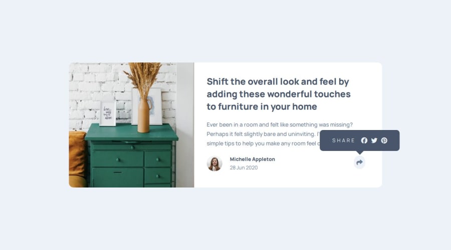
I don't know how to put the share button over the share banner when it's responsive. You'll see what I mean when you change the size below 500px.
Community feedback
- @C3asarPosted 8 months ago
Your solution looks nice on the desktop layout but you should revisit it when you change it to mobile layout if you need any help let me know
1@Benji963Posted 8 months ago@C3asar I need help with the mobile version I tried to test at 500px, but hit a wall with trying to keep the share button with the share banner. I put the banner next to the share button instead and moved on.
0@C3asarPosted 8 months ago@Benji963 I implemented a JavaScript function named displayShare() to manage the visibility of the .author (author infos) and .share (social media icons) elements. When a user interacts with the share button or resizes the window, this function dynamically adjusts the display based on the screen size. For desktop screens (with a width greater than 800 pixels), only the share element is toggled. However, for mobile screens, both the share and author elements are toggled, and a background color class is applied to the parent element of the share for styling purposes. This ensures a seamless transition between mobile and desktop displays.
0@Benji963Posted 8 months ago@C3asar OK, I found the problem it was a simple solution I needed to use Z-index to make the share button pop in front of the banner (icon, social media gray line). I fixed the code and made it more responsive.
0@AshongAbdallah06Posted 7 months ago@Benji963.You could add another markup and style it to look like the mobile version. It should have a
display: noneat first, and when the screen is less than 500px, set adisplay: initialon it, and adisplay: nonethe desktop's markup. This is what I mean;/**Desktop Share Markup**/ <div class="share-hidden desktop">.................</div> /**Mobile Share Markup**/ <div class="share-hidden mobile">.................</div>.desktop { display: // Add the normal styles; } .mobile { // Also add the normal styles; display: none; } @media (max-width: 500px) { when the screen is less than 500px .desktop { display: none; //Hiding the desktop markup. } .mobile{ display: initial; //Showing the desktop markup. }I hope you find this helpful!! If there's any problem with it feel free to reach out.
Marked as helpful1
Please log in to post a comment
Log in with GitHubJoin our Discord community
Join thousands of Frontend Mentor community members taking the challenges, sharing resources, helping each other, and chatting about all things front-end!
Join our Discord
