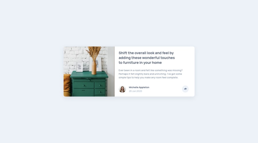


Design comparison

Solution retrospective
Feedback is welcome :)
Community feedback
- @ApplePieGiraffePosted almost 2 years ago
Hi, Hyeon Park! 👋
Good work on this challenge! 👍 Your solution looks pretty great! 👏
A few suggestions I have are,
- In the mobile view, setting the width of the card component to
100%and then adding a max-width to it to prevent it from becoming too wide when there's extra space around it. This is often better than setting the width of the element to a fixed value or percentage because it'll ensure that the element only takes up as much space as it should be allowed but also shrinks accordingly when the space around it shrinks. Currently, things get a little wonky when the width of the screen gets really, really small (which isn't a huge issue in this case, but this pattern can help you in future projects). - Making sure that the social media popup can be seen in the mobile view. Currently, it is only displayed in the desktop view.
- Making the social media icons links, not buttons (since when clicked, they should take the user to their respective social media site).
Hope you find this helpful. 😊
Keep coding (and happy coding, too)! 😁
1@hkparkjsPosted almost 2 years ago@ApplePieGiraffe
I fixed mobile view issue and made social media icon to links after I saw your comment.
Thank you for your detailed advice! :) but I didn't understand your first comment, so Could you explain the comment more detail (example)?
0@ApplePieGiraffePosted almost 2 years ago@hkparkjs
Hey!
I just mean that instead of setting specific width for the card component like this,
.card {
  width: 500px;
}
...you should set the width to be a percentage and then add a max-width to prevent the card component from becoming too wide, like this,
.card {
  width: 100%;
  max-width: 500px
}
That way, you should you notice that when you decrease the size of the screen, the width of the card decreases when necessary (instead of remaining a fixed width and causing horizontal scroll bars to appear).
Hope that makes sense!
1@ApplePieGiraffePosted almost 2 years agoBtw, I'd also suggest avoiding using
pxfor setting the value ofwidthin your styles. Instead, use a responsive unit such asemorremso that users will be able to change the size of things in your site by changing the default font-size of their browser. It might also be worth setting the values for other properties such asmarginorpaddingin those units so that your entire site will scale with the user's chosen default font-size. If you'd like to learn more about those units in CSS and how all of this works, check out this helpful video on the topic.1@hkparkjsPosted almost 2 years ago@ApplePieGiraffe
I understood your comment and it's very useful for me! I will use the way as you commented. Thank you very much :)
1 - In the mobile view, setting the width of the card component to

Please log in to post a comment
Log in with GitHub
Join our Discord community
Join thousands of Frontend Mentor community members taking the challenges, sharing resources, helping each other, and chatting about all things front-end!
Join our Discord