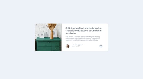
Article preview component

Solution retrospective
Not much to feel proud of this time around since I was barely able to complete the challenge and my solution is extremely far from perfect as evidenced by the various bugs I was unable to fix. As far as what I would do differently next time, I guess I'd try to organize my markup elements in a much more concise way that also allows to retrieve them from the DOM more coherently.
What challenges did you encounter, and how did you overcome them?Lots of challenges, but the biggest one was basically making the share button display different things according to the viewport size. I was able to overcome this by using the window.matchMedia() method and assinging the value of a desired breakpoint to a variable which was later used on a function that would work differently based on wether or not the screen size matched the one assigned to the variable.
What specific areas of your project would you like help with?While the solution to the problem previously outlined kind of worked, it only did so when loading the page on a certain screen size and sticking to it. Loading the page on a mobile display would make the share button work as long as one remained on that display. However, when trying to go from mobile to desktop display or viceversa, the behaviors of the button would overlap and the speech bubble meant for desktop display would show on mobile, or the SNS bar meant for mobile would show on desktop. I had no idea how to solve this problem and would appreciate some insights on what I coul do differently.
Please log in to post a comment
Log in with GitHubCommunity feedback
No feedback yet. Be the first to give feedback on alvarozama's solution.
Join our Discord community
Join thousands of Frontend Mentor community members taking the challenges, sharing resources, helping each other, and chatting about all things front-end!
Join our Discord