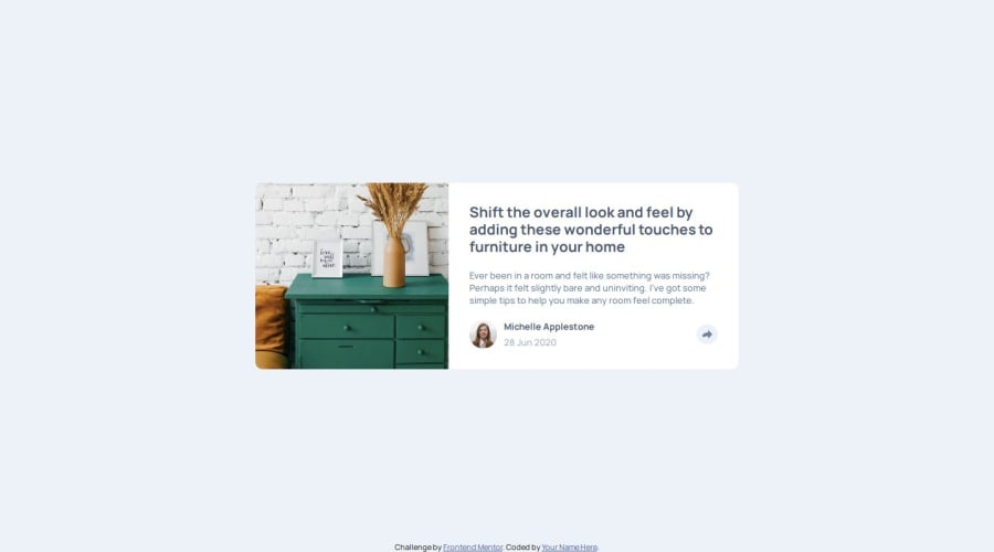
Design comparison
Solution retrospective
The challenge I faced and effectively decided to not focus on is the svg share button. I included it as img tag but then figured out that I won't be able to change the fill colors of the path in svg element. Then I switched to svg within html but decided it is not worth the effort and went back to the img tag.
If I could get a little feedback on the styling of the popup as I wasn't really sure how to make sure it adjusts to any screen width - mainly the very small sizings. When you resize my project to weird resolutions the author data can be seen from beneath when the mobile popup is open, even though it shouldn't be visible. Any suggestions in this matter would be helpful.
Join our Discord community
Join thousands of Frontend Mentor community members taking the challenges, sharing resources, helping each other, and chatting about all things front-end!
Join our Discord
