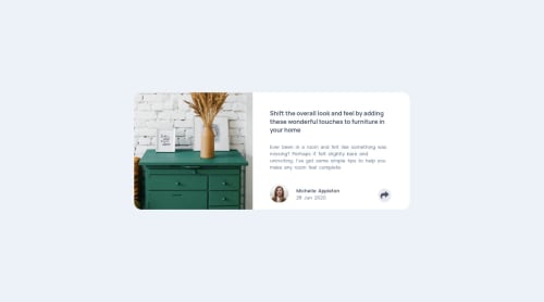
Submitted about 3 years agoA solution to the Article preview component challenge
ARTICLE PREVIEW COMPONENT
@Mar1362

Solution retrospective
i added a little animation in mobile views but not in desktop views because i was lazy :) but do not worry, a day i'll do back all my challenges and at that time i'll do everything needed plus your suggestion and your feedback which will be well received
Code
Loading...
Please log in to post a comment
Log in with GitHubCommunity feedback
No feedback yet. Be the first to give feedback on Mamadou Mar's solution.
Join our Discord community
Join thousands of Frontend Mentor community members taking the challenges, sharing resources, helping each other, and chatting about all things front-end!
Join our Discord