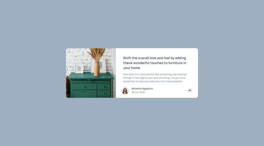
Design comparison
Solution retrospective
Sup o/ Kinda forget about that one for 3 months but I finally did it :) My biggest problem in this project was the share popup. I was trying to use the same popup on both mobile and desktop and I basically couldn't do it for a whole day. Got myself misunderstand the use of relative/absolute positioning (took a while to understand that it just works between parent/child elements).
First I tryed to display the popup when :hovering the share button but ended up puting some JS to handle it.
One thing that I would like to have finished was keep showing the share Button while the popup was active - tried doing this with z-index, but it ended up messing up with the popup position, so I left it behind.
Good practice after all <3
Community feedback
Please log in to post a comment
Log in with GitHubJoin our Discord community
Join thousands of Frontend Mentor community members taking the challenges, sharing resources, helping each other, and chatting about all things front-end!
Join our Discord
