Design comparison
Solution retrospective
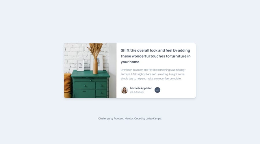
Using a combination of tailwind and JS :)
What specific areas of your project would you like help with?I need a bit of help with share button in mobile preview. Since it is toggle on/off in mobile screen size it is positioned below the 'share-box' but when I set position and put the z-1 it is on top but on same position (because of flex I believe) so one of the link is below it and it is not usable 😅.
And if anyone knows a good JS course? I watched a few and when I do watch and follow along it is very logical and easy but this little bit of code took me long enough to understand that I need to really master the basics and learn to recognize the steps myself.
Thank you!
Community feedback
Please log in to post a comment
Log in with GitHubJoin our Discord community
Join thousands of Frontend Mentor community members taking the challenges, sharing resources, helping each other, and chatting about all things front-end!
Join our Discord
