Design comparison
SolutionDesign
Solution retrospective
Any and all feedback welcome. Pick it apart please!
Please log in to post a comment
Log in with GitHubCommunity feedback
- @lemreyes
Hello Shawnathan,
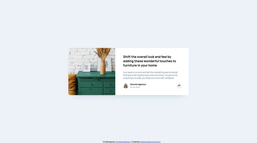
Great work on the layout, it looks the same as the original. Some comments though:
- when clicking the share button in the desktop view the "popup" bar is not in aligned to the share icon. I think you could fix this by using position: absolute instead of position: fixed.
- you might also want to try semantic HTML tags <article>, <header>, <section> instead of generic <div>'s
Join our Discord community
Join thousands of Frontend Mentor community members taking the challenges, sharing resources, helping each other, and chatting about all things front-end!
Join our Discord
