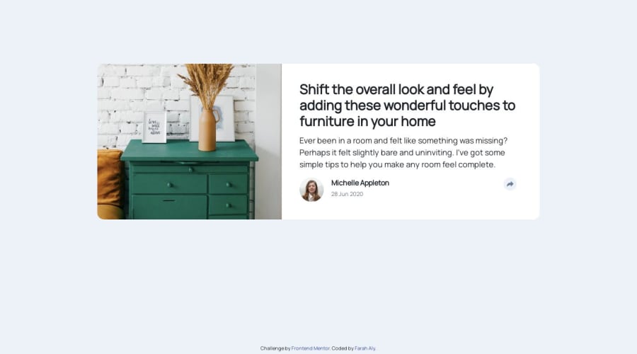
Design comparison
Solution retrospective
Any feedback on how this can be approved is much appreciated!! From tools and technical advice to writing cleaner and better code, everything is helpful. Thanks!
Community feedback
- @ovidiuantonioPosted over 4 years ago
Hello Aly,
Very nice solution, for desktop especially. For the mobile versions you have some problems:
- the breakpoint that's at 800px is not really good, the card is overflowing the screen size, try to find a better one, and try to use the dev tools to review the site between 750-800px, because you changed the width of the card but you didn't rearranged the content inside of it.
- the popup on the mobile version is not properly placed
I like how you did the popup on hover, not on click, nice job!
Happy coding! Keep going!
1@f-m-a-lyPosted over 4 years agoWill definetely work on fixing that. Thanks for the feedback!
0 - @rfilenkoPosted over 4 years ago
Hi, good job, but I have a few points for you how to improve:
- first, check and fix errors;
- use proper font, size, more attention on those small details;
- bootstrap and jquery are really overkill for this simple component, next time try not to use them at all;
- check responsiveness.
Keep coding😉, Roman
1@f-m-a-lyPosted over 4 years ago@rfilenko Thank you very much for your feedback! The jQuery doesn't do anything actually; as you said I thought it was an overkill as well and scrapped it and just used CSS to do what I needed instead. As for Bootstrap, I completely agree with you. I thought it would be a good project to try it out though as I hadn't use Bootstrap before so I wanted to check out the card elements. I will review responsiveness and push those changes. I've noticed a couple of glitches here and there. Thanks again!
0
Please log in to post a comment
Log in with GitHubJoin our Discord community
Join thousands of Frontend Mentor community members taking the challenges, sharing resources, helping each other, and chatting about all things front-end!
Join our Discord
