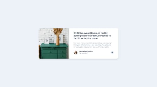
Submitted over 1 year agoA solution to the Article preview component challenge
Article Preview Component
@Caelus111

Solution retrospective
What are you most proud of, and what would you do differently next time?
this is the first projects after a long haitus, so I am kinda pround of returning to making things with JS.
What challenges did you encounter, and how did you overcome them?the gray pop up was kinda hard at first but just with little thought, I got it
What specific areas of your project would you like help with?I think I need help in thinking of the right sequence of doing the project... i get lost because i dont think about how I am gonna do X thing, I just do it without thinking...
Code
Loading...
Please log in to post a comment
Log in with GitHubCommunity feedback
No feedback yet. Be the first to give feedback on Caelus's solution.
Join our Discord community
Join thousands of Frontend Mentor community members taking the challenges, sharing resources, helping each other, and chatting about all things front-end!
Join our Discord