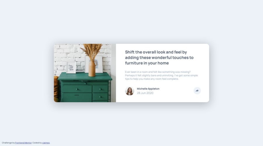
Design comparison
Solution retrospective
any feedback is appreciated!!
Community feedback
- @AkoToSiJeromeEhPosted over 1 year ago
Hi! Great Work Out There . I noticed that when the screen size is smaller, the social media images have a space between them due to the "justify-content: space-between" property in the .pop-up class. However, based on the design reference, it should be aligned to the start when the screen are smaller and have a margin, resulting in a smaller amount of space between them. (the bold text is the code I add on your source code) I hope this adjustment works and helps. Happy coding!
@media (max-width: 700px)
.pop-up {
width: 100%;
height: 70px;
padding-right: 30%;
border-radius: 0;
justify-content: start;
} .pop-up > img {
aspect-ratio: 1/1;
object-fit: contain;
margin:10px;you can adjust this
}
Marked as helpful0
Please log in to post a comment
Log in with GitHubJoin our Discord community
Join thousands of Frontend Mentor community members taking the challenges, sharing resources, helping each other, and chatting about all things front-end!
Join our Discord
