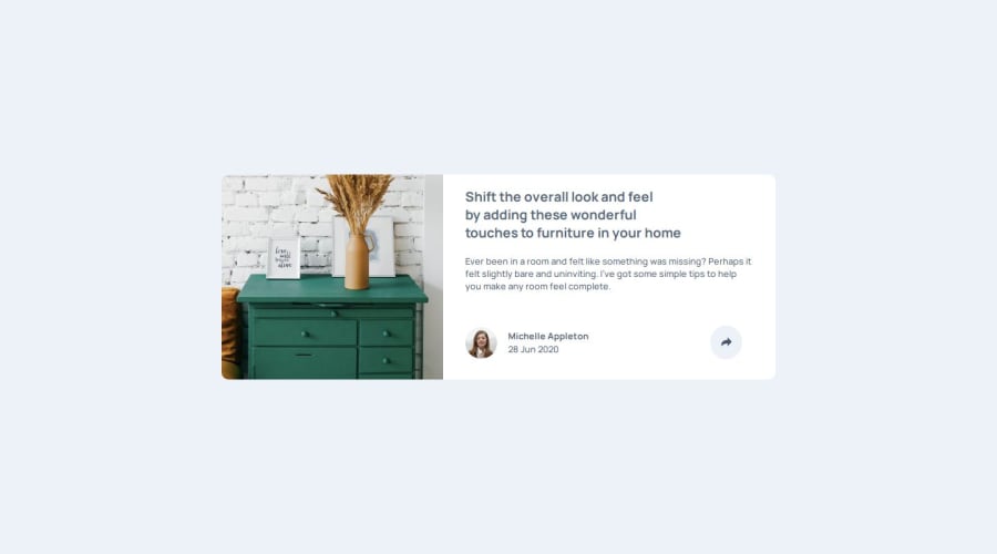
Design comparison
Solution retrospective
I managed to get the "Share" popup positioned correctly on both mobile and desktop.
What challenges did you encounter, and how did you overcome them?The biggest challenge was having the button appear alongside the overlay on the mobile layout. After quite a bit of experimenting, I made it work using absolute positioning and z-index.
What specific areas of your project would you like help with?I think I got it mostly right, as always I'm open to feedback :)
Community feedback
- @konradbaczykPosted 4 months ago
I can give u one tip :) Try to keep the order of the properties in CSS file. For example: u can keep it alphabetical or every time dimensions of the element (class) at the beginning, z-index at the end etc. It will help you to read your own code later because you will automatically know where properties are located :)
Marked as helpful1
Please log in to post a comment
Log in with GitHubJoin our Discord community
Join thousands of Frontend Mentor community members taking the challenges, sharing resources, helping each other, and chatting about all things front-end!
Join our Discord
