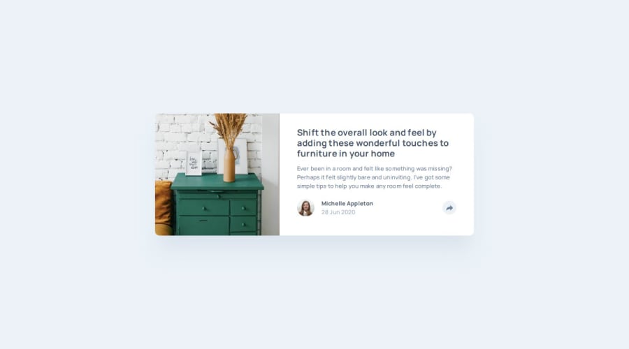


Design comparison

Solution retrospective
I am proud of the work and practice. Always learning something new give me joy.
What challenges did you encounter, and how did you overcome them?Changing the color of the SVG at hover, have to investigate in Stack Overflow looking for alternatives. Finally find a solution, erased the property fill from the svg and give that property with CSS.
There are different ways to show the links section when the user clicks the share button, i write what i was thinking and help me to order my ideas.
What specific areas of your project would you like help with?Please comment what you would do different. Any advice will be helpful.
Responsiveness is something that i will love to get feedback and suggests.
Community feedback
- @AhmedElbassuonyPosted 2 months ago
great but i think mobile version need some work
Marked as helpful0P@Franciscoj91Posted 2 months ago@AhmedElbassuony Thanks for your comment.
Could you be more specific? I make a minor fix for the card height, fixing a vertical overflow.
0@AhmedElbassuonyPosted 2 months agothis advice not from me it's copied from @khatri2002 comment in my solution
@Franciscoj91 Hi @AhmedElbassuony!
The developed solution looks great!
Here’s a suggestion to improve your approach for positioning the social share box:
You’ve used position: absolute; for the social share box (div having class share), and the bottom section (div having class share-continer) is set to position: relative;.
To position the box on top of the button, fixed values like:
right: -108px; top: -75px; were assigned. While this approach works, it relies on trial-and-error to determine the exact values, which isn’t scalable or maintainable for future changes, such as design tweaks or component reuse.
Improved Approach: Instead of positioning the box relative to the bottom section, position it relative to the button. This approach eliminates the need for fixed values and ensures the social share box is perfectly aligned with the button.
Create a Wrapper Div: Wrap both the button and the share box in a container div and assign position: relative; to this wrapper. The share box will now be positioned relative to this wrapper.
<div class="share-wrapper"> <button id="share-button">...</button> <div class="share">...</div> </div> Center Align the Box Horizontally: Use the following CSS to center the share box horizontally relative to the button:.share { position: absolute; top: [some-value]; /* Adjust for spacing between button and box */ left: 50%; transform: translateX(-50%); } This approach ensures that the share box aligns perfectly to the button without relying on trial-and-error values.
Handle Desktop and Mobile Responsiveness:
For desktop, the share-wrapper container will handle the relative positioning. For mobile, maintain the bottom section’s position: relative; and adjust the wrapper’s positioning accordingly. You can achieve this by overriding the wrapper’s position at specific breakpoints, from relative to static.
Why This Approach? Avoids Fixed Values: Eliminates the need for hardcoding values like top: -75px; right: -108px;. Maintains Scalability: Any future adjustments to the layout (e.g., button size or card size) won’t break the positioning. Enhances Maintainability: The CSS becomes cleaner and easier to update as the layout evolves. Great work so far! With these adjustments, your solution will be even more robust. Keep up the amazing effort! You're doing great! 🚀
1

Please log in to post a comment
Log in with GitHubJoin our Discord community
Join thousands of Frontend Mentor community members taking the challenges, sharing resources, helping each other, and chatting about all things front-end!
Join our Discord