

Design comparison

Solution retrospective
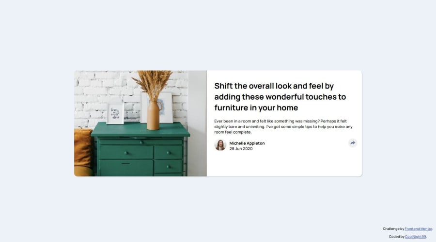
I think I got the design and functionality pretty close.
What challenges did you encounter, and how did you overcome them?I struggled with creating the tooltip. I used position: absolute but I'm not sure if that was the correct approach.
Community feedback
- @Lukas3162000Posted 4 months ago
Great job on this submission! The design is really well-executed, and it’s clear that you’ve put a lot of effort into getting it as close to the original as possible. The overall layout looks clean and professional, and the functionality appears to work seamlessly, which is a big plus.
Your tooltip implementation is clever, and it integrates nicely into the design. If you’re unsure about using position: absolute, don’t worry—it’s a valid approach, but experimenting with position: relative in combination with flexible parent containers might make the positioning more adaptable, especially for responsive layouts. Speaking of responsiveness, separating the logic for desktop and mobile behavior more distinctly could make your code easier to manage and fine-tune for different screen sizes.
Overall, this is an excellent submission, and you should be proud of how close you’ve come to matching the design and functionality. Keep up the great work, and best of luck with future challenges! 😊
Marked as helpful0@CoolNight99Posted 4 months ago@Lukas3162000 Thank you for the detailed feedback! I appreciate it.
0 - @MAY55APosted 4 months ago
Nice effort, here are some changes to consider:
- add semantic HTML (at least a main tag) and alternate texts to images for better accessibility.
- make the container and the font smaller to match the design.
- instead of defining the width of the article container by specifying a margin, just try specifying a width so it stays constant even when the screen size is changing.
- try adjusting the width of the image when the screen is smaller by giving it a width relative to the total card width ( you can use % for example).
- try positioning the share div exactly on top of the author div for the mobile layout and making the share div invisible.
0


Please log in to post a comment
Log in with GitHubJoin our Discord community
Join thousands of Frontend Mentor community members taking the challenges, sharing resources, helping each other, and chatting about all things front-end!
Join our Discord