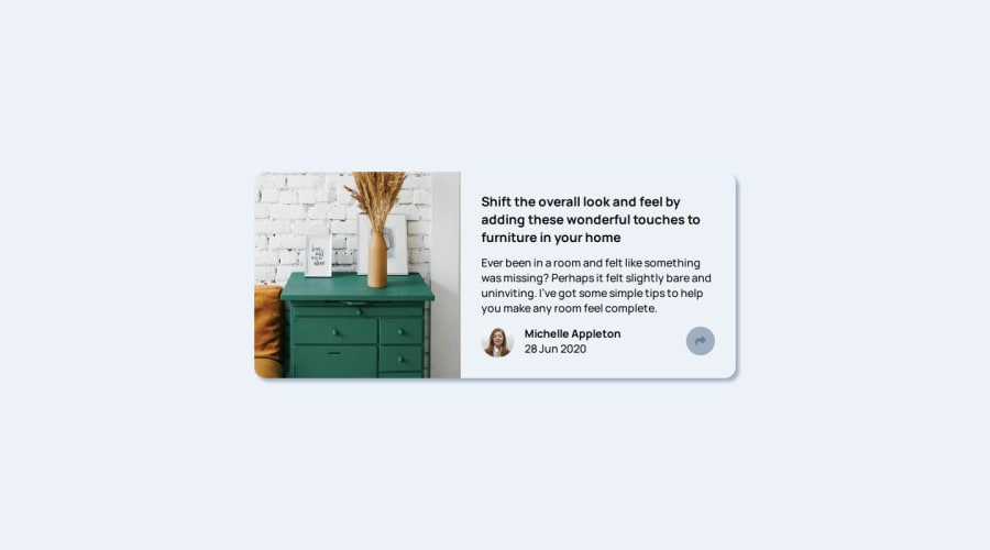
Design comparison
Solution retrospective
intially i felt uncomfortable about the share_container postioning, later some what i adjusted. learnt about new dom manupilation selecting html element
let shareContainer = document.getElementsByClassName('share_container')[0]; // Get the first element with the collection of class 'share_container'
What specific areas of your project would you like help with?i want to improve my share_Container cuz its seems not much correct as the challenge how to make that look like that can anyone say. if there are any suggestions im happy to take
Community feedback
- @sanyomor-01Posted 5 months ago
You did a great work. It would be great if you check the colors and apply them on the appropriate text. Other than that, nice work.
1
Please log in to post a comment
Log in with GitHubJoin our Discord community
Join thousands of Frontend Mentor community members taking the challenges, sharing resources, helping each other, and chatting about all things front-end!
Join our Discord
