

Design comparison

Solution retrospective
i am proud of nothing. i have watched several videos on scrimba and yet I struggled so much with this smh
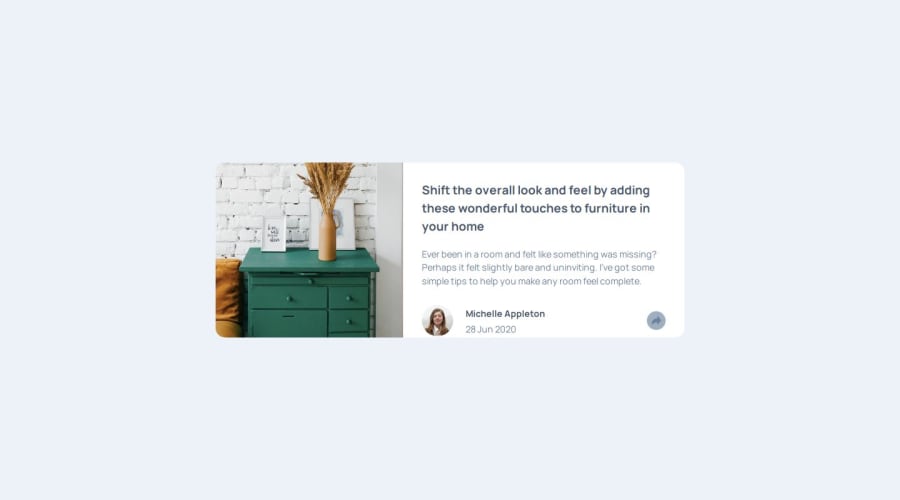
What challenges did you encounter, and how did you overcome them?the speech bubble - for some reason the positioning of it was very difficult and confusing. For the Tablet and PC sizes, I used relative positioning at first and it seems okay at first but it looked bad in my mobile phone. Then I edited it and used absolute, it kinda worked and I don't even know why. I guess I still do not fully understand the difference between absolute and relative positions.
What specific areas of your project would you like help with?The positioning of the speech bubble please
Please log in to post a comment
Log in with GitHubCommunity feedback
No feedback yet. Be the first to give feedback on Stryde2022's solution.
Join our Discord community
Join thousands of Frontend Mentor community members taking the challenges, sharing resources, helping each other, and chatting about all things front-end!
Join our Discord