Design comparison
SolutionDesign
Solution retrospective
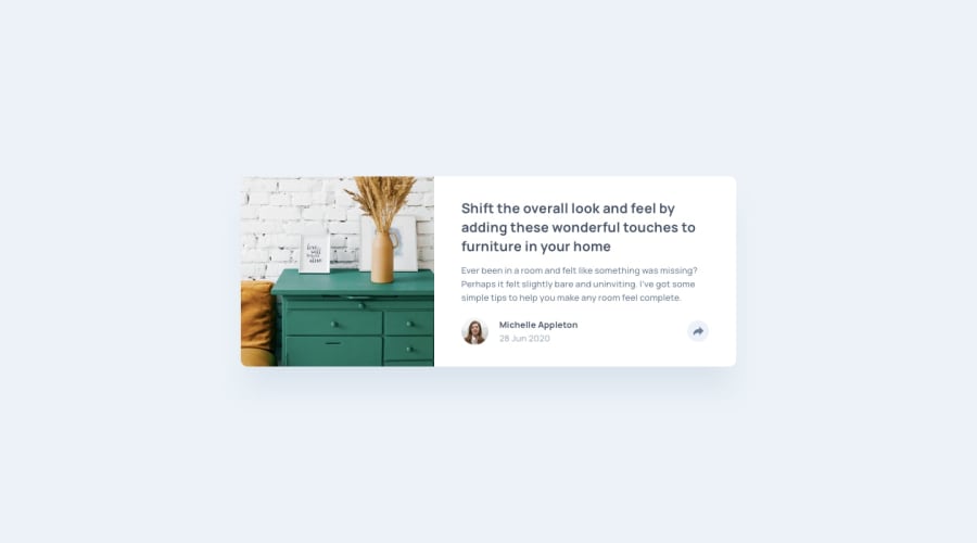
Hi guys, this is my solution for this challenge. Please, give me some feedback. I know this solution is not the best, but it is working. So I would love to hear how to make it better. Thanks <3
Community feedback
- @SatheesAPosted almost 2 years ago
Looks nice and well executed to replicate the original layout and styles.. some issues I noticed:
- your share button is an
<a>tag and not a button. Interactive elements should rather be buttons instead of anchors.. Anchors should be used to link to something. - you have a fixed width on your
.card, both on mobile and desktop views.. you should have some room to scale down or up.. On mobile it won´t scale down to 320px sized mobiles... You should rather usemax-width. - your arrow from the "bubble" pointing down on the button is a little bit missplaced so it´s not aligned to the share button.. Thats just a minor issue.
Marked as helpful0 - your share button is an
Please log in to post a comment
Log in with GitHubJoin our Discord community
Join thousands of Frontend Mentor community members taking the challenges, sharing resources, helping each other, and chatting about all things front-end!
Join our Discord
