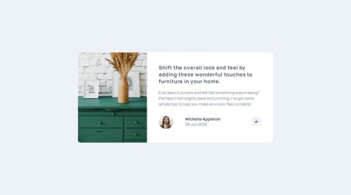
Article preview component

Solution retrospective
I'm most proud of the fact that I got the javascript working in a sort of way.
What I would do differently next time is find other more efficient ways to create a the share container that pops up when I click on the share button.
What challenges did you encounter, and how did you overcome them?The challenges I encountered were getting the share container that shows up when the share button is clicked to stay over the share button as in being centered over it and allowing it to stay over it when the screen size changes.
I did not overcome this challenge.
What specific areas of your project would you like help with?I would like help with getting the share container that shows up when the share button is clicked to stay over the share button as in being centered over it and allowing it to stay over it when the screen size changes.
Please log in to post a comment
Log in with GitHubCommunity feedback
No feedback yet. Be the first to give feedback on Bunchydo's solution.
Join our Discord community
Join thousands of Frontend Mentor community members taking the challenges, sharing resources, helping each other, and chatting about all things front-end!
Join our Discord