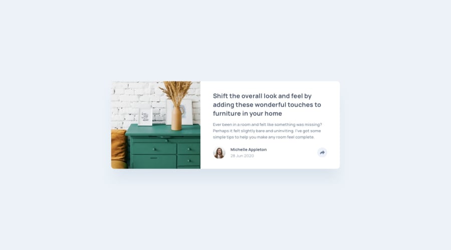
Design comparison
Solution retrospective
Any Comments would be appreciated on making it better ! Thank you !
Community feedback
- @mattstuddertPosted over 4 years ago
Hey Sijan, nice work on this challenge. Your overall layout for the component is great. As you can see from the screenshot comparison the spacing and font sizing are just slightly off. I'd recommend having a go at getting it as close to the design as possible. Attention to detail is a key skill for front-end developers, so it's good to practice as much as possible.
I'd avoid setting click listeners on non-interactive elements, like the
divelement. These can't be accessed by anyone not using a mouse/trackpad to navigate the content, which is a bad practice. Instead, add click listeners to interactive elements likeaorbutton. This will ensure the element is focusable and can be accessed by people not using a mouse/trackpad.For the "share" text, you've uppercased the content in the HTML itself. Try to avoid doing that as some screen reader software will read this content letter-by-letter which makes that content inaccessible to screen reader users. Instead, write it normally in your HTML and then use
text-transform: uppercase;in your CSS to visually uppercase the text to match the design.Have you ever tried using
min-widthmedia queries instead ofmax-width? It's quite a common workflow with front-end developers to use them and work mobile-first. It can often lead to less CSS code and has the benefit of loading in fewer styles for mobile users, which can be a nice performance gain.I hope these tips help! Let me know if you have any questions 🙂
3
Please log in to post a comment
Log in with GitHubJoin our Discord community
Join thousands of Frontend Mentor community members taking the challenges, sharing resources, helping each other, and chatting about all things front-end!
Join our Discord
