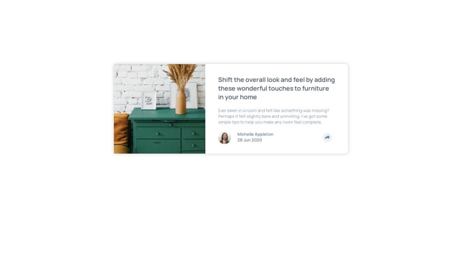
Design comparison
SolutionDesign
Solution retrospective
Feel free to comment any improvements that I could do to this project!
Community feedback
- @DiarrahPosted over 4 years ago
Good job on your solution! 🎉
I would make a few recommendations: ・Make the body a min-height: 100vh and display: flex so that the wrapper will centered in the middle of the page. ・I wouldn't out a 25vh margin above & below on the wrapper I would just make it auto. ・When resizing I would make the wrapper flex-direction: column. ・It's not good practice to put the word "picture" or "image" in an alt tag because screen-readers automatically add that word anyways when they're reading an img tag
Hope that helps! Diarrah
1
Please log in to post a comment
Log in with GitHubJoin our Discord community
Join thousands of Frontend Mentor community members taking the challenges, sharing resources, helping each other, and chatting about all things front-end!
Join our Discord
