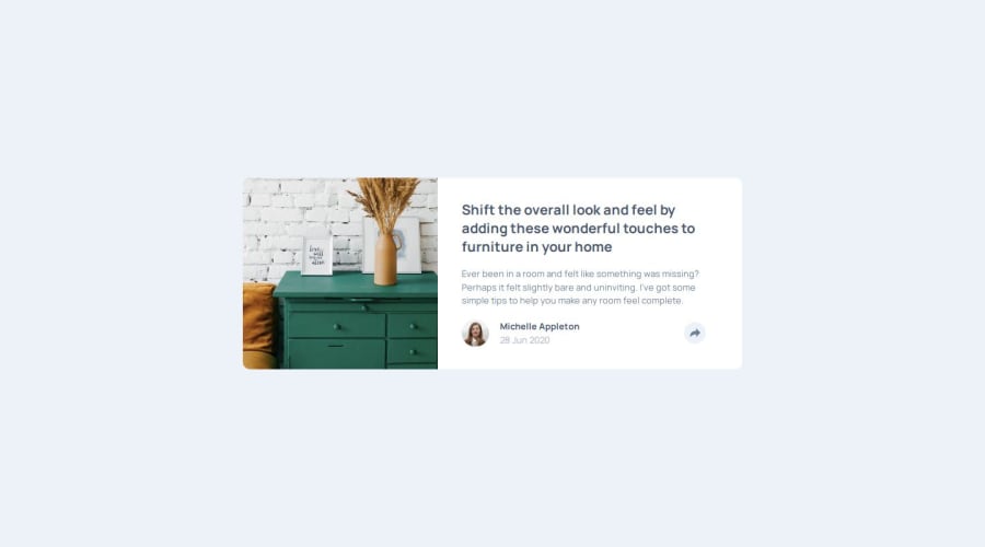
Design comparison
Solution retrospective
Really enjoyed this exercise's problem-solving. Surprisingly, I found the JS relatively simple compared to several CSS points I got stuck on. The elegant layout hides some tricky selection challenges that took some Googling and trial-and-error.
The share icon caused me to learn how to change a child based on hovering a parent. Like everything, easy when you know how.
I was also very proud of my lateral problem-solving when I found the pop-up share bar wasn't translating well in portrait view. Instead of obsessing over local properties, I took a step more global, to realize I set the bar as a child of the share icon, rather than child of the card's footer. I would normally spend an hour driving myself crazy in the local div, but was proud to think literally 'outside the box' to find the cause. Not long ago, this would have taken me an hour, now it took me 5-10 minutes.
What challenges did you encounter, and how did you overcome them?My image sizing and cropping is still very awkward. I'm never sure whether to work with the image itself or make it relative to container. The Every Layout intrinsic sizing properties helped me out a lot with the cropping.
The share bar shape was a really fun problem-solving exercise. I tried to draw the shape in polygon but couldn't navigate the rounded corners. Eventually I decided to make it a composite of two divs: one rounded box, and one polygon triangle, joined together using absolute positioning. It did feel very hacky fine-tuning the pixel perfection, but happy with the result.
What specific areas of your project would you like help with?I'm still very unsure how best to handle SVGs in a modular way. I wanted to keep the icons in external files, and tried a few src and object properties to embed them, but could not get CSS to modify the embed. I eventually gave up: copy-and-pasted SVG paths straight into the HTML, and select svg from there.
Looking at Stack Overflow, it seems like many are struggling with the same issue. There seems to be a lack of established best practice for modular SVG work without long-winded JS work-arounds. So, not really sure.
Community feedback
- @anhnguynPosted 5 months ago
Wow, I enjoy reading your progress log here! I did the same challenge yesterday, and gotta say I wish my HTML were as clean as yours :)
- For the arrow, you can look up pseudo elements in CSS and create it with :after.
- For the SVG, I actually use SVG sprites. I don't think it's the best way, but the syntax is cleaner and the performance is better than copying and paste SVG directly into the HTML.
Hope we can share some feedback about this challenge!
0
Please log in to post a comment
Log in with GitHubJoin our Discord community
Join thousands of Frontend Mentor community members taking the challenges, sharing resources, helping each other, and chatting about all things front-end!
Join our Discord
