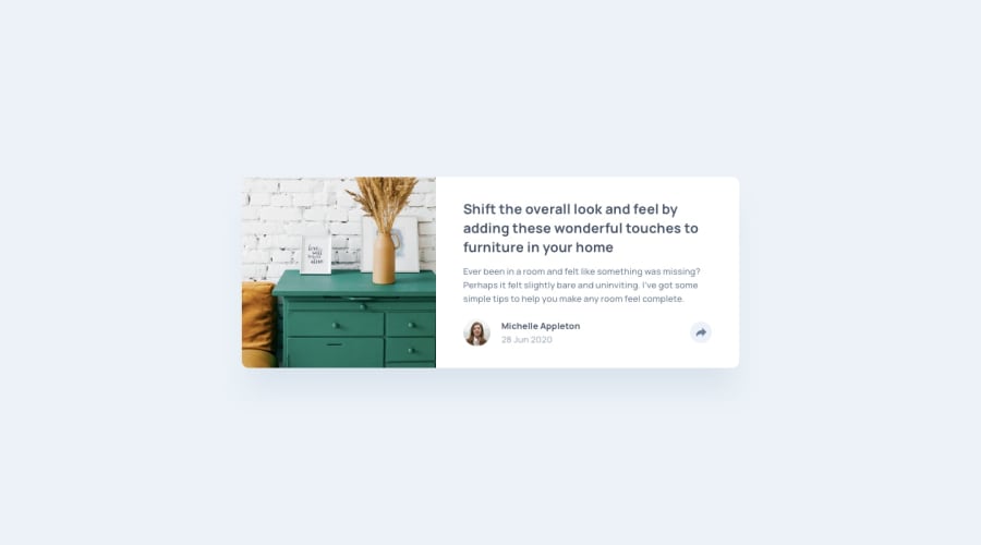
Design comparison
SolutionDesign
Community feedback
- @BenheminPosted 6 months ago
You did a great job on making it look really close to the design good job!
If you want to go back and touch it up, somethings I notice are the lack of a box shadow on the main card, and the proportions of the 2 columns are slightly off compared to the design.
Marked as helpful0@ajkun55Posted 6 months agoThank you for your advice, yes I did omit the box shadow and the width of stuff not exactly same, Iwould not redo it recently, but if I do, these would be priority. I guess the output is not our sole purpose, the skills learned from the building process is much important. Have fun building projects! @Benhemin
0
Please log in to post a comment
Log in with GitHubJoin our Discord community
Join thousands of Frontend Mentor community members taking the challenges, sharing resources, helping each other, and chatting about all things front-end!
Join our Discord
