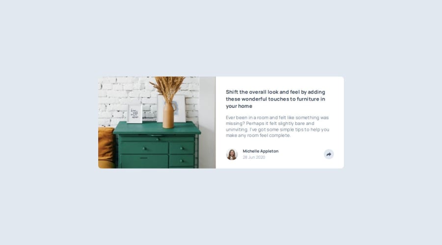
Design comparison
SolutionDesign
Solution retrospective
What are you most proud of, and what would you do differently next time?
use popover component from headlessui for the popup panel of social media icon
What challenges did you encounter, and how did you overcome them?different design of desktop and mobile for the social media panel, at last i decide to create both version and show when screen size different
What specific areas of your project would you like help with?In mobile version, when you click on the share icon then social media panel will popup but the icons is slightly adjust the gap between and i not sure how to deal with it
Community feedback
Please log in to post a comment
Log in with GitHubJoin our Discord community
Join thousands of Frontend Mentor community members taking the challenges, sharing resources, helping each other, and chatting about all things front-end!
Join our Discord
