Submitted 7 months ago
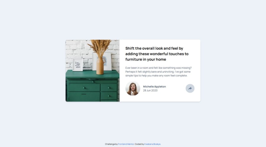
Article Preview Card with Vite, React, Typescript, TailwindCSS
@Kingkobi01
Design comparison
SolutionDesign
Solution retrospective
What are you most proud of, and what would you do differently next time?
How I made the share component that looks like a tooltip in medium and up screens and a normal block element in small screens
What challenges did you encounter, and how did you overcome them?Correctly positioning the tooltip on medium and large screens. TailwindCSS made my work a lot easier
What specific areas of your project would you like help with?Animations
Community feedback
Please log in to post a comment
Log in with GitHubJoin our Discord community
Join thousands of Frontend Mentor community members taking the challenges, sharing resources, helping each other, and chatting about all things front-end!
Join our Discord
