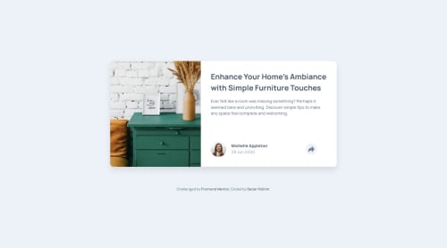
Submitted over 1 year agoA solution to the Article preview component challenge
Article Preview Card
@sedaryildirim

Solution retrospective
What are you most proud of, and what would you do differently next time?
Few design differences, mainly with the active share button state on the desktop view - was just a personal preference to keep the length of the share card within the borders of the main wrapper/article!
Code
Loading...
Please log in to post a comment
Log in with GitHubCommunity feedback
No feedback yet. Be the first to give feedback on Sedar Yildirim's solution.
Join our Discord community
Join thousands of Frontend Mentor community members taking the challenges, sharing resources, helping each other, and chatting about all things front-end!
Join our Discord