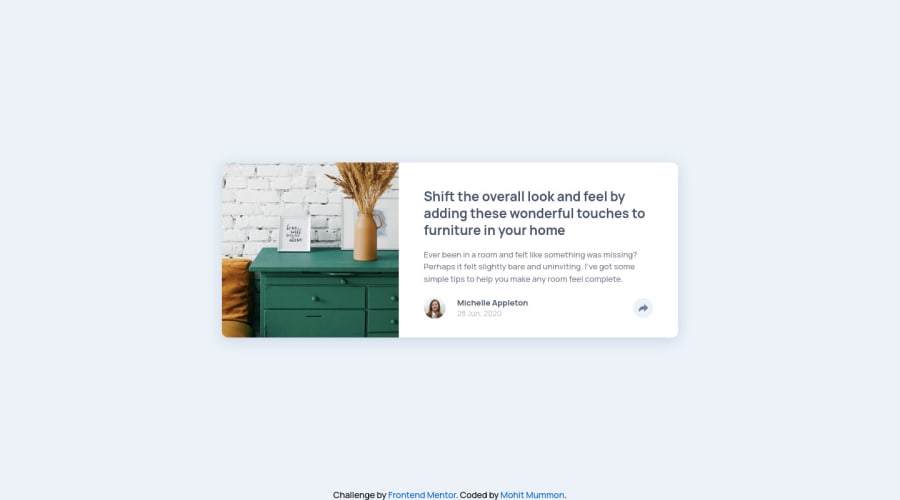
Design comparison
SolutionDesign
Solution retrospective
I had a little trouble with the image sizing here. I couldn't get it to match up to the design as I would have liked. If you have any advice for me that would be appreciated
Community feedback
- @faha1999Posted about 2 years ago
Hello, Mohit Mummon Congratulations on finishing this project. It's lovely and great on the whole! Just a little tips:
-
add favicon
<link rel="icon" type="image/png" sizes="32x32" href="./images/favicon-32x32.png"> -
You might want to use semantic tags like the
<main>to wrap your code, instead ofdiv. like
<main>
<div class="wrapper"></div>
<div class="attribution"></div>
</main>
This would help improve accessibility.
- I saw in the
.cssthat sometimes you usepx&rem. To optimize your speed when resizing fonts for various displays and devices, substituteremoremrather thanpx. These components work better to improve the accessibility of your website.REMapplies to all sizes, not just the font size.
I hope it will work. Happy coding.
Marked as helpful0 -
Please log in to post a comment
Log in with GitHubJoin our Discord community
Join thousands of Frontend Mentor community members taking the challenges, sharing resources, helping each other, and chatting about all things front-end!
Join our Discord
