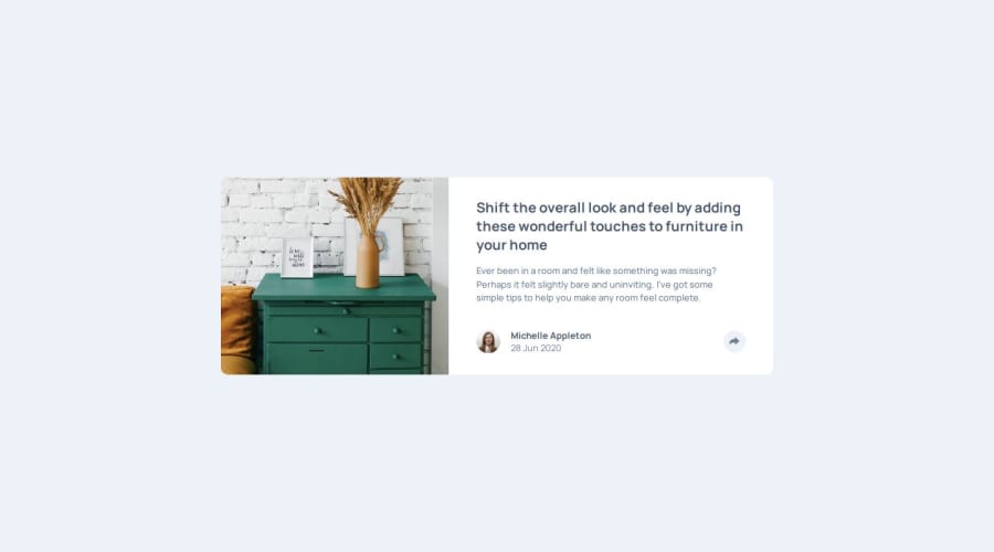
Not Found
Not Found
Not Found
Not Found
Not Found
Not Found
Not Found
Not Found
Not Found
Not Found
Not Found
Not Found
Not Found
Not Found
Not Found
Not Found
Not Found
Not Found
Not Found
Not Found

Submitted

Article preview by Kikino

Kikino02 160

@Kikino02

Desktop design screenshot for the Article preview component coding challenge

This is a solution for...

  • HTML
  • CSS
  • JS
1newbie
View challenge

Design comparison


SolutionDesign

Solution retrospective


What are you most proud of, and what would you do differently next time?

.

What challenges did you encounter, and how did you overcome them?

Adding pop-ups when the icon was clicked was hard for me...

What specific areas of your project would you like help with?

Please give me advice, how to improve my code...

Community feedback

P
Gilbert 290

@juliengDev

Posted

Hi @Kikino02,

First of all, great job on completing this project! It wasn’t an easy task, and you should be proud of what you’ve accomplished. Here are a few observations and suggestions for improvement:

1.	Breakpoints: The first breakpoint arrives at 1440px, but it could be more effective to set a breakpoint around 900px. This way, you can ensure elements display correctly before the design breaks.
2.	Animated Transitions: For an enhanced user experience, consider adding an animated transition to the sharing button. This would allow it to appear and disappear more smoothly, creating a more natural feel.
3.	Social Media Links: The social media icons currently don’t have associated URLs, so they don’t redirect to the respective social media sites. Adding these links would improve functionality.
4.	Height Property: I noticed you used the height property several times. It’s generally advised to avoid setting fixed heights in CSS to prevent breaking the design. Allow elements to adapt more naturally by using relative or flexible height values.
5.	Width Property: Similarly, try to avoid using fixed widths. Instead, opt for responsive properties like min-width and max-width to ensure the layout remains flexible.
6.	Responsive Units: Instead of pixels, consider using responsive units like em, rem, %, or vw. Kevin Powell’s courses on responsive design are an excellent resource for this and can help you improve in this area.
7.	Display vs Visibility: It’s often better to avoid using display: none and instead use visibility: hidden and opacity: 0. This approach keeps the element in the document flow, making it easier to animate and transition, which results in a smoother user experience.

Overall, you’ve done a fantastic job sticking to the design and implementing the features. Congratulations, it wasn’t easy, and you should be proud of your efforts. Keep up the great work!

Best, @juliengDev

0

Please log in to post a comment

Log in with GitHub
Discord logo

Join our Discord community

Join thousands of Frontend Mentor community members taking the challenges, sharing resources, helping each other, and chatting about all things front-end!

Join our Discord