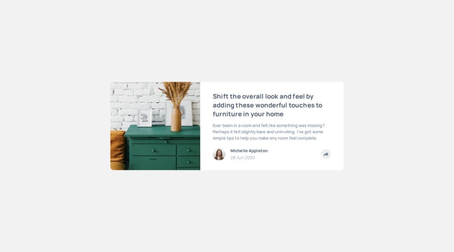
Design comparison
Solution retrospective
See the next question.
What specific areas of your project would you like help with?I see the share button has 3 colors : 1) The normal color where no share links are displayed 2) The color when the share links are displayed in portrait mode (bottom of the card). The color when share links are displayed in landscape mode (the tooltip is opened). I do know how to change the background of the button (background-color css property) but I was spending too much time to figure out how to change the color of the curved arrow. I'd really appreciate someone letting me know what do I need to do :)
Join our Discord community
Join thousands of Frontend Mentor community members taking the challenges, sharing resources, helping each other, and chatting about all things front-end!
Join our Discord
